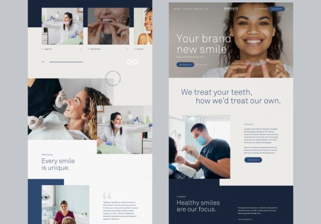
In today’s digital age, where smartphones reign supreme, optimizing your dental practice’s online presence for mobile devices is no longer just a luxury—it’s a necessity. With Google’s mobile-first indexing becoming increasingly influential, ensuring your dental website design is mobile-friendly has never been more critical. In this comprehensive guide, we’ll explore the intricacies of mobile optimization and equip you with the knowledge to propel your practice to the forefront of digital success.
What Is A Mobile-Friendly Dental Website Design
Okay, first things first: what exactly is a mobile-friendly dental website? Well, it’s pretty much what it sounds like—a website that’s designed to look and work great on your smartphones and tablets. Think of it as your favorite app—easy to use, easy to navigate, and easy on the eyes.
When you pull up a mobile-friendly dental website design on your phone, everything fits perfectly on your screen, and you can tap and swipe your way around without any trouble. It’s like having your dentist’s office right in the palm of your hand!
Why Mobile Matters
Now, you might be wondering, “Why does this even matter?” Here’s the scoop: these days, most people are glued to their phones, including when they’re searching for dental services. So, if your website isn’t mobile-friendly, you could be missing out on tons of potential patients. Plus, Google loves mobile-friendly sites, so it can actually help you rank higher in search results. Pretty cool, right?
Imagine someone’s searching for a dentist on their phone, and they come across your dental website design. If it’s clunky and hard to use on mobile, they’ll probably bounce right off and check out a competitor instead. But if your site is sleek and mobile-friendly, they’ll be much more likely to stick around and book an appointment with you. It’s all about giving people the best experience possible, no matter what device they’re using. Also read best practice for home page.
Optimizing Your Website
Alright, let’s talk about how to make your website mobile-friendly and super awesome for your visitors.
Keep Content Consistent
One biggie is making sure the stuff on your website—like the text, pictures, and links—is the same whether someone’s looking at it on their computer or their phone. This makes it easier for Google to find and show your site to people searching for dental services.
So, when you’re designing your dental website design, make sure everything looks just as good on mobile as it does on desktop. That means using responsive design, which automatically adjusts your site’s layout and content to fit different screen sizes. With responsive design, you don’t have to worry about people squinting at tiny text or struggling to tap on tiny buttons—it’s all taken care of for you!
Place Ads Smartly
If you’re running ads on your site (which can be a great way to promote your practice), be smart about where you put them, especially on mobile. You don’t want ads popping up in annoying places that make it hard for people to use your site. Stick to Google’s recommendations for ad sizes and placements to keep things smooth and user-friendly.
When it comes to mobile ads, less is often more. You want to strike the right balance between promoting your services and providing a seamless browsing experience. So, think carefully about where you place your ads and how they might impact the user experience on mobile devices.
Make Visuals Look Great
Pictures and videos can really make your dental website design stand out, but they need to look good on mobile too. Use high-quality images and videos that load quickly and look awesome on smaller screens. And don’t forget to add descriptions to your visuals so Google knows what they’re all about!
When optimizing images and videos for mobile, it’s important to strike a balance between quality and performance. You want your visuals to look great without slowing down your site’s load time. So, be sure to compress your images and videos appropriately and use formats that are optimized for mobile devices.
Check with Google
Once you’ve made your dental website design all mobile-friendly, it’s a good idea to double-check with Google to make sure it’s up to snuff. Google Search Console is a free tool that can tell you how Google sees your site and if there are any issues you need to fix. It’s like giving your website a health check-up!
Google Search Console provides valuable insights into your site’s performance on mobile devices and can help you identify any areas for improvement. By regularly monitoring your site’s mobile-friendliness in Google Search Console, you can ensure that your site is always optimized for the best possible user experience.
Get Some Help
If all this website stuff sounds like a lot, don’t worry! You can always team up with experts who specialize in making awesome dental websites. They know all the ins and outs of mobile optimization and can help you create a site that’s not only easy to use but also helps you attract more patients.
When it comes to mobile optimization, it’s okay to ask for help. Working with experienced professionals can save you time and effort and ensure that your site is optimized for the best possible results. So, don’t be afraid to reach out to experts who can help you take your dental practice to the next level online!
Conclusion
So, there you have it—your crash course in making your dental website design mobile-friendly. By following these tips and tricks, you’ll be well on your way to reaching more patients and growing your practice in the digital age. So, grab your smartphone, give your website a makeover, and get ready to welcome a whole bunch of new smiles through your doors!


